
Planning summer family photos means thinking beyond poses and locations, the colors everyone wears can make or break the final result. A well-coordinated color scheme pulls the eye through the frame, keeps the focus on faces, and creates a polished look that feels intentional, not accidental. Whether you’re shooting in the backyard, at the beach, or in a flower field, the right palette turns snapshots into frame-worthy prints. This guide walks through proven summer family photo color schemes that work with natural light, complement outdoor settings, and photograph beautifully without looking overly staged.
Table of Contents
ToggleKey Takeaways
- Summer family photo color schemes create visual harmony that keeps focus on faces and expressions rather than competing clothing colors.
- Nautical blues and whites, soft pastels, bold vibrant colors, and earth tones are proven palettes that photograph beautifully in natural sunlight.
- Use the 60-30-10 rule when coordinating bold colors: 60% neutral base, 30% primary color, and 10% accent color to avoid visual chaos.
- Match your color scheme to your location—green settings work with earth tones or soft blues, beaches suit nautical palettes, and urban backgrounds handle bold hues.
- Test your chosen palette at the actual photo location and time of day before the shoot, as smartphone photos against the backdrop reveal how colors truly photograph in natural light.
- Balance pastels with neutral pieces to avoid an Easter-basket effect, and pair earth tones with texture-rich fabrics like linen and denim for depth without adding competing colors.
Why Color Coordination Matters for Family Photos
Color coordination isn’t about matching outfits head-to-toe, it’s about creating visual harmony that doesn’t distract from the people in the frame. When colors clash or compete, the viewer’s eye bounces around the photo instead of landing on expressions and connections.
Photographs capture light differently than the human eye. Bright neons can blow out in direct sun, turning faces into afterthoughts. Too many competing patterns or color families fragment the composition. A coordinated palette creates a cohesive baseline that lets skin tones stand out and keeps the focus where it belongs.
Think of your color scheme as the foundation layer. It sets the mood, whether that’s calm and classic, energetic and bold, or soft and romantic. Summer’s abundant natural light amplifies whatever you choose, so intentional selection pays off. A family wearing complementary shades of blue and cream reads as pulled-together in a way that random wardrobes don’t.
Coordination also helps photos work across different settings within a single session. If you’re moving from a sunny field to shaded woods, a well-chosen palette adapts to shifting backgrounds without looking out of place. It’s the difference between photos that feel like a collection and photos that feel like a set.
Classic Summer Color Schemes That Never Go Out of Style
Nautical Blues and Whites
Navy, sky blue, and crisp white form a timeless trio that photographs exceptionally well in bright summer light. This palette works because it offers strong contrast without harshness, the blues anchor the frame while whites reflect light and keep things fresh.
For execution, start with navy as the base for one or two family members, then layer in lighter blues (chambray, powder, or periwinkaker) and whites for the rest. Avoid pure white tops in harsh midday sun: they can overexpose and lose detail. Cream or off-white alternatives photograph better and still deliver that clean, coastal feel.
This scheme pairs beautifully with beach settings, but it’s not limited to sand and surf. It works equally well against green grass, weathered docks, or even urban brick. The key is maintaining the two-to-three color ratio, too many shades of blue muddy the palette, while too much white washes out the composition. Many home styling guides use similar balance principles when coordinating room palettes.
Accessories matter here. Tan sandals, straw hats, or denim jackets add texture without breaking the color story. Skip red or bright yellow accents, they’ll hijack the visual flow.
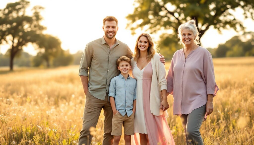
Soft Pastels for a Dreamy Summer Vibe
Pastels, blush pink, lavender, mint, peach, and soft yellow, create a light, airy feel that suits golden-hour lighting and garden settings. This palette works best when you limit it to three pastel shades plus one neutral (white, beige, or light gray) to ground the look.
The trick with pastels is avoiding the Easter-basket effect. Don’t dress everyone in full pastel outfits. Instead, use pastels as accent colors: a blush dress paired with khaki pants, a lavender shirt with white shorts, a mint cardigan over a cream dress. The neutral pieces act as visual breathing room.
Pastels photograph best in soft, diffused light, think late afternoon or overcast days. Harsh noon sun can flatten pastels and reduce their delicate tonal range. If you’re shooting midday, seek open shade under trees or building overhangs.
This scheme shines in locations with natural greenery or floral backdrops. The soft colors complement rather than compete with blooming gardens or meadows. It’s a go-to for families who want photos that feel gentle and timeless without going full neutral.
Bold and Vibrant Color Palettes for Standout Photos
If your family’s personality leans energetic, bold summer colors deliver photos with serious visual punch. Think coral, turquoise, bright yellow, and deep teal, saturated hues that hold up against strong sunlight and vivid backgrounds.
The rule here: pick one or two bold colors and balance them with neutrals. A family where everyone wears bright colors creates chaos. Instead, let one person wear the statement color (a coral maxi dress, a turquoise button-up) while others wear white, tan, denim, or olive to support without competing.
Bold palettes work best in graphic settings, modern architecture, minimalist beaches, desert landscapes, or anywhere the background won’t fight for attention. They can overwhelm busy backdrops like heavily patterned gardens or cluttered urban scenes. According to seasonal style insights, bold color palettes resonate particularly well with West Coast outdoor aesthetics.
When mixing bold colors, use the 60-30-10 rule: 60% neutral base, 30% primary bold color, 10% accent bold color. This keeps the palette from tipping into clown-car territory. For example: three family members in white and khaki (60%), one in coral (30%), and one in a turquoise accessory or shirt (10%).
Avoid mixing warm and cool bolds in the same palette, coral and turquoise work because they’re analogous on the color wheel. Coral and royal blue? That’s a clash. Stick to either warm bolds (coral, yellow, orange) or cool bolds (turquoise, cobalt, lime) within a single scheme.
Earth Tones and Neutrals for Natural Outdoor Settings
Earth tones, olive, rust, terracotta, mustard, and warm browns, blend seamlessly with natural outdoor environments and create a grounded, organic feel. This palette has surged in popularity because it photographs beautifully across seasons and doesn’t date quickly.
Start with one or two earth tones as anchors (olive green, burnt orange), then fill in with neutrals like cream, tan, soft gray, or denim. The neutrals prevent the palette from feeling too heavy or monochromatic. A family photo with everyone in brown reads flat: mixing in cream and soft gray adds dimension.
This scheme excels in golden-hour light, the warm tones in the clothing harmonize with the warm tones in the sunlight, creating a cohesive, almost painterly quality. It’s also forgiving in mixed lighting, transitioning well from sun to shade without dramatic color shifts.
Earth tones pair naturally with rustic settings: wooden fences, tall grasses, desert landscapes, barn exteriors, or wooded trails. They also work surprisingly well in modern contexts, clean concrete, industrial backdrops, where the warmth of the palette softens hard edges. For inspiration on balancing warmth in visual design, many curated home projects demonstrate similar tonal strategies.
Texture plays a bigger role here than in other palettes. Linen shirts, knit cardigans, denim, and leather accessories add visual interest without needing pattern or additional color. Keep patterns minimal, small checks or subtle stripes at most. Large florals or busy prints fight the understated vibe.
How to Choose Colors That Complement Your Photo Location
The background dictates half the color decision. A scheme that’s stunning against white sand can disappear against pale dunes, and bold colors that pop on a city street can clash with a wildflower field.
Start by identifying the dominant color in your location. Greenery-heavy settings (parks, gardens, forests) pair well with earth tones, soft blues, or blush pinks, colors that contrast without competing. Avoid wearing green in green settings unless you want family members to blend into the foliage.
For beach or waterfront locations, blues and whites are classic, but coral, turquoise, and warm neutrals also work because they echo sunset tones and sand. Skip browns and olives, they can look muddy against sand and lack contrast with driftwood or rocks.
Urban or architectural settings handle bold colors and high contrast well. Bright yellows, deep teals, or black-and-white combinations stand out against concrete, brick, or metal. Pastels can get lost in these environments unless the background is very minimal.
If your location has colorful elements, murals, painted buildings, vibrant flora, choose a neutral-heavy palette with one accent that either complements or contrasts intentionally. Trying to match every color in a busy background creates visual noise.
Test your palette ahead of time if possible. Visit the location, take smartphone photos of fabric swatches or outfit pieces against the backdrop, and review them. Colors that look great in your living room might read completely differently in natural light at the actual site. Adjust before the shoot, not after when you’re stuck with photos that don’t work.
Finally, consider the time of day. Golden hour warms everything, so cool-toned palettes (blues, purples) provide balance. Midday sun is harsh and neutral, so any palette works if properly balanced. Overcast days flatten colors slightly, making bold choices more effective than subtle pastels.